Worxx Partners
B2B/B2C SaaS Landing & Brand Identity
From zero to a converting product in 4 weeks

The problem
Two seasoned IT recruitment experts were launching a new venture but starting from absolute zero. No brand. No digital presence. No way for their target users (IT talents and HR teams) to understand what they offer, trust it, and take action. The risk was real: without a clear, compelling product to point to, their launch would fall flat regardless of their expertise. They needed more than a website, they needed a brand that could carry their vision, a UX that could convert visitors into clients, and someone who could own the entire build without fragmenting it across multiple agencies or freelancers. That's where I came in.


My Contribution
This wasn't a handoff project. I owned the full stack, from first strategic conversation to going live.
As a Strategist
I ran several alignment sessions with the founders to extract their vision, define business goals, KPIs, USP, target segments, and key risks. I used a Product Strategy Canvas to structure everything, a tool that forced clarity on both sides: it gave the founders a sharper picture of their market position, and gave me a solid foundation to design against rather than guessing.
As a Designer
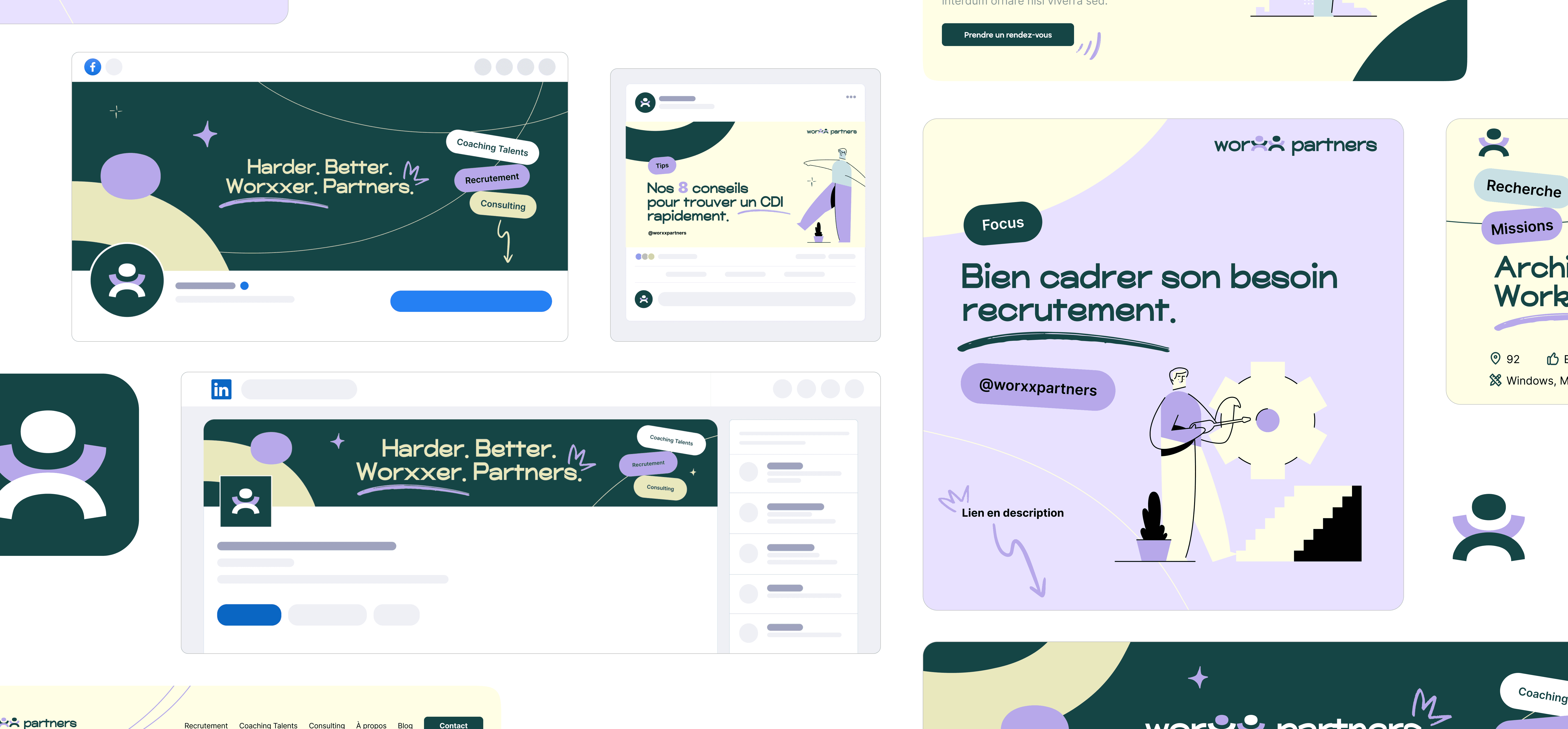
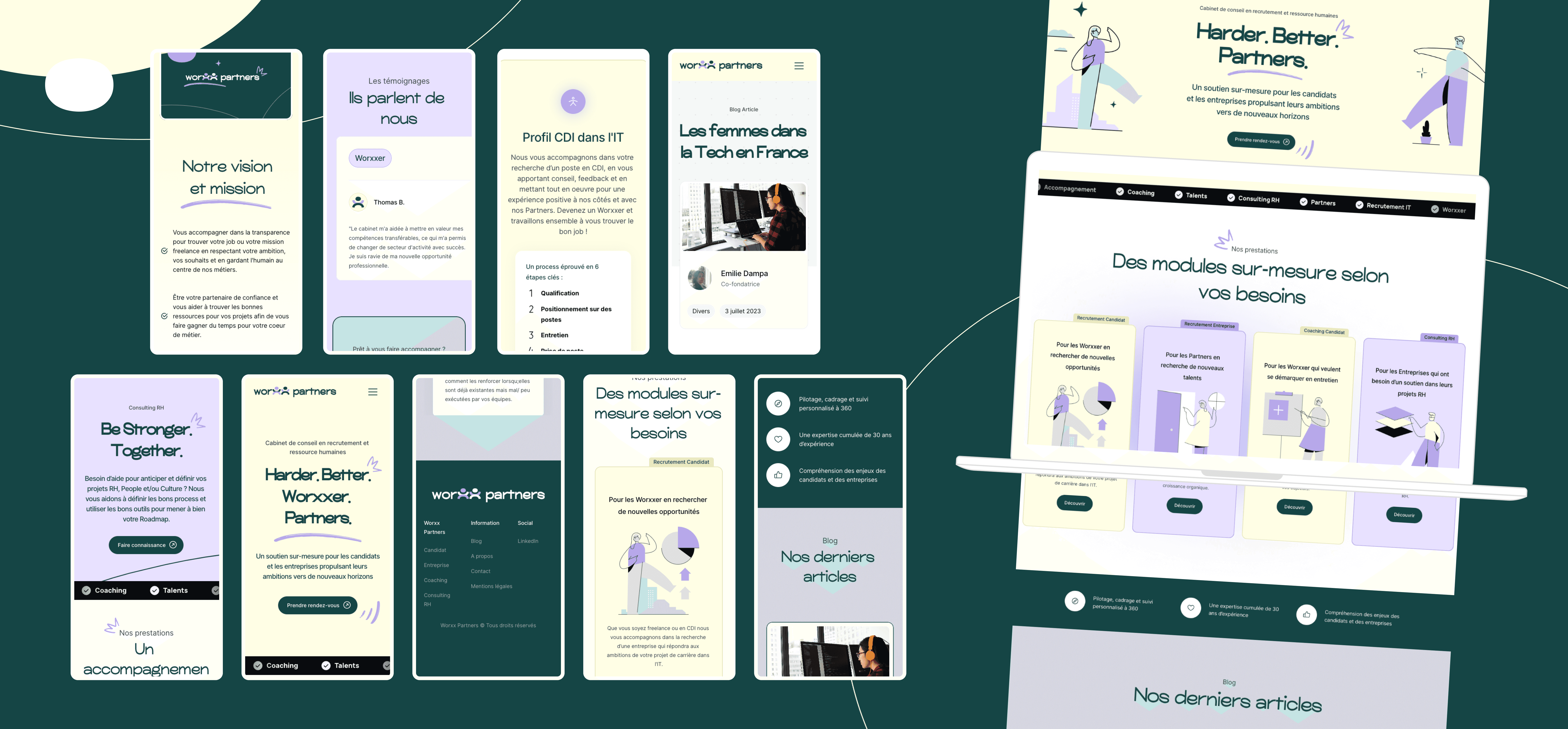
I built the brand identity from scratch: logo, color system, typography, illustration assets, and designed the full UX/UI across all pages. I ran various user interviews (IT talents on my end, HR profiles on theirs) to create personas and user stories that kept design decisions grounded in real needs, not assumptions.
As a Builder
I developed the entire site in Framer with no dev team, no handoff delays. I set up Google Analytics, configured the blog, and prepared all marketing visuals. The result: a fully functional, responsive product launched on time.


Key Decisions
Framer over a traditional CMS
The founders needed to own and update their content autonomously after launch. Framer gave us design fidelity without sacrificing their independence post-delivery. It also let me iterate in real-time during testing, collapsing the gap between design and dev into a single workflow.
A bold, optimistic visual identity in a conservative market
HR and recruitment branding tends to play it safe: corporate blues, neutral tones, generic stock imagery. I pushed for a distinct palette and a minimalistic-but-warm art direction to help Worxx Partners stand out and signal a different kind of company (human, modern, approachable). The "X" logo was designed to carry both the brand name and the idea of partnership with a deliberate double meaning, not decoration.
Contextual inquiry over classic usability testing
Rather than a standard task-based test, I used contextual inquiry, giving users realistic scenarios tied to their actual jobs. This surfaced friction points that a lab-style test would have missed, and resulted in targeted, high-confidence improvements before launch.


Impact & measure
The project ended at delivery: the client had no need for ongoing support after launch. As a result, I don't have post-launch performance data to share here. But here's what I would have tracked, and why.
Primary metric, module selection rate
The core business goal was to convert visitors into clients by getting them to select and book a coaching module. That's the north star. Everything else is context for understanding why that number moves or doesn't.
Secondary metrics
Scroll depth on the homepage: to validate whether the value proposition was being read before users hit the CTA, or if they were bouncing before getting there.
CTA click-through rate: specifically on the module cards, to understand if the UX was guiding users toward conversion or creating friction.
Traffic source breakdown: given the B2B/B2C dual audience, I'd want to know if organic, direct, or referral traffic was driving the most qualified visits. That would have informed any future content or SEO strategy.
Return visitor rate: relevant for the HR/B2B segment, where the purchase decision is rarely immediate. A high return rate would signal that the brand was sticking.
What I'd have done with that data
The first 60 days post-launch would have been a learning sprint: identify the highest drop-off point in the conversion funnel, run two or three targeted UX adjustments, and measure the delta. Nothing radical, just closing the loop between design decisions and real user behavior.
Stack & Process at a glance
Product Strategy → User Research → Brand Identity → UX/UI Design → Prototyping → User Testing → Framer Dev (no code) → Analytics Setup → Launch